In this article, I'll break down the three jobs every driving school website must do, along with the specific steps needed to build a high-performing site — with real examples of weak competitor websites alongside stronger sites I've built for partner schools, that you can apply to your own business.
The Three Jobs Every Driving School Website Must Do
A driving school website should do three things well. When it does all three, it becomes one of the most valuable tools for growing your business.
Build Trust
Show you're professional, experienced, and reliable.
Provide Answers
Clearly explain pricing, classes, schedules, requirements, and services.
Bring in Students
Make it easy to register, book lessons, submit forms, or contact you.
Build Trust
People are trusting you with their safety, time, and money. Your website should make them feel confident choosing your school. Clean design, real photos, reviews, credentials, and clear contact information all help.
Provide Answers
Most visitors come to your website with questions. If they can quickly find what they need, they're more likely to choose you instead of continuing to search elsewhere.
Bring in New Students
Once someone is ready, the next step should be simple. Clear buttons, easy forms, online registration, and fast contact options help turn visitors into paying customers.
Steps to Create a Driving School Website That Wins More Business
Start With a Clear Plan
Before building your website, decide what you want it to accomplish. Ask yourself:
- What services do I want to promote most?
- Who is my ideal customer?
- Why should someone choose my school instead of a competitor?
- What do I want visitors to do first?
Your answers shape everything on the website — the wording, images, layout, and next steps.
Plan the Pages and Customer Journey
Before designing the site, decide what pages you need. Every driving school needs at least:
- Home
- About
- Courses
- Contact
Each page should have a clear purpose and guide visitors to the next step. Just as importantly, avoid unnecessary pages. Too many options overwhelm visitors and cause them to leave. Every extra page is another chance for someone to click away from the actions that actually grow your business.
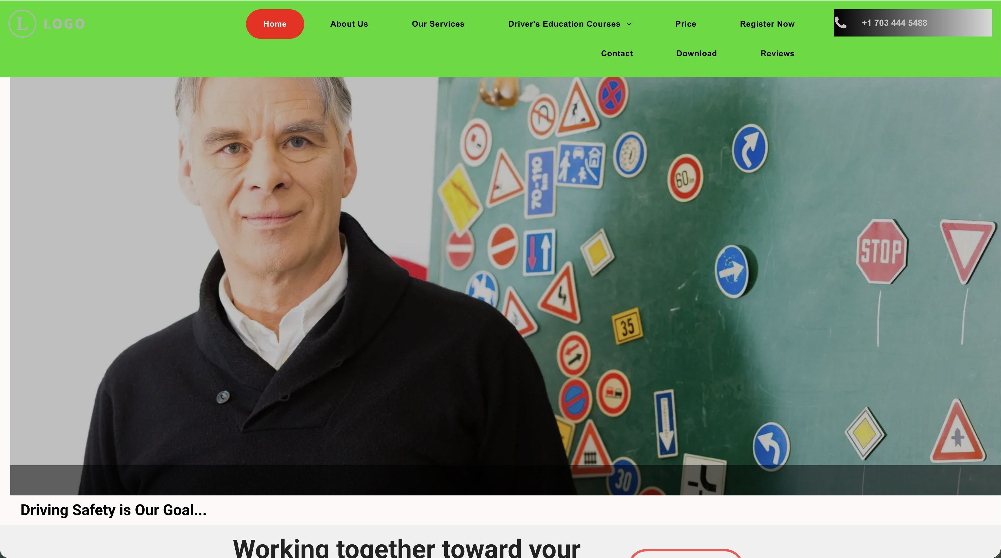
- Too many menu options. The header is crowded with unnecessary pages. "Download," for example, should only appear after a student has already registered — not as a main option for new visitors.
- The Home tab is highlighted in red. That pulls attention to the page the visitor is already on. The space should guide them toward the next step instead.
- The phone number is hard to read and not clickable. Many visitors — especially on mobile — want to call immediately. If the number is hard to find or tap, you lose leads.
- No clear next action. The main image has no strong button, message, or direction. Visitors are left guessing.
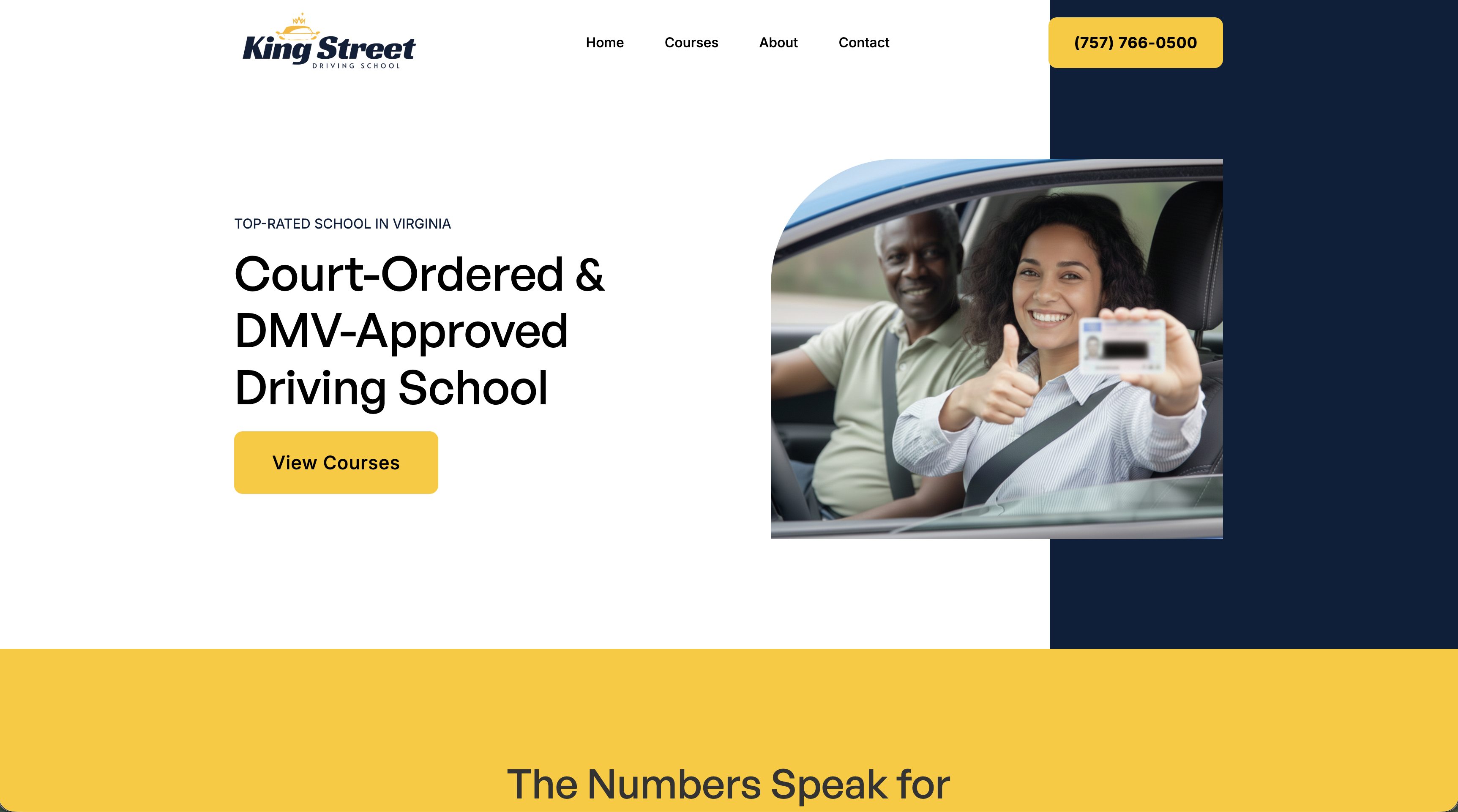
- Two clear actions stand out immediately. Call the school, or find the right course. Both are visible without scrolling, and the bright yellow buttons naturally draw attention.
- Simple navigation. The menu is clean and easy to understand, with only a few choices — making it faster to find what visitors actually need.
When a visitor clicks Courses, they're taken directly to the section where they can quickly choose the course that fits their needs.
Write Clear, Helpful Website Content
The words on your website matter. They should build trust, answer questions, and help visitors feel ready to sign up. Strong driving school website content should focus on three things:
- Helping visitors feel confident they're choosing the right course
- Showing that courses are approved and properly certified
- Answering common concerns right away — What if I fail? Can I use my phone? Are refunds available?
Keep your message simple. Too much text overwhelms people and makes it harder for visitors to find what they need.
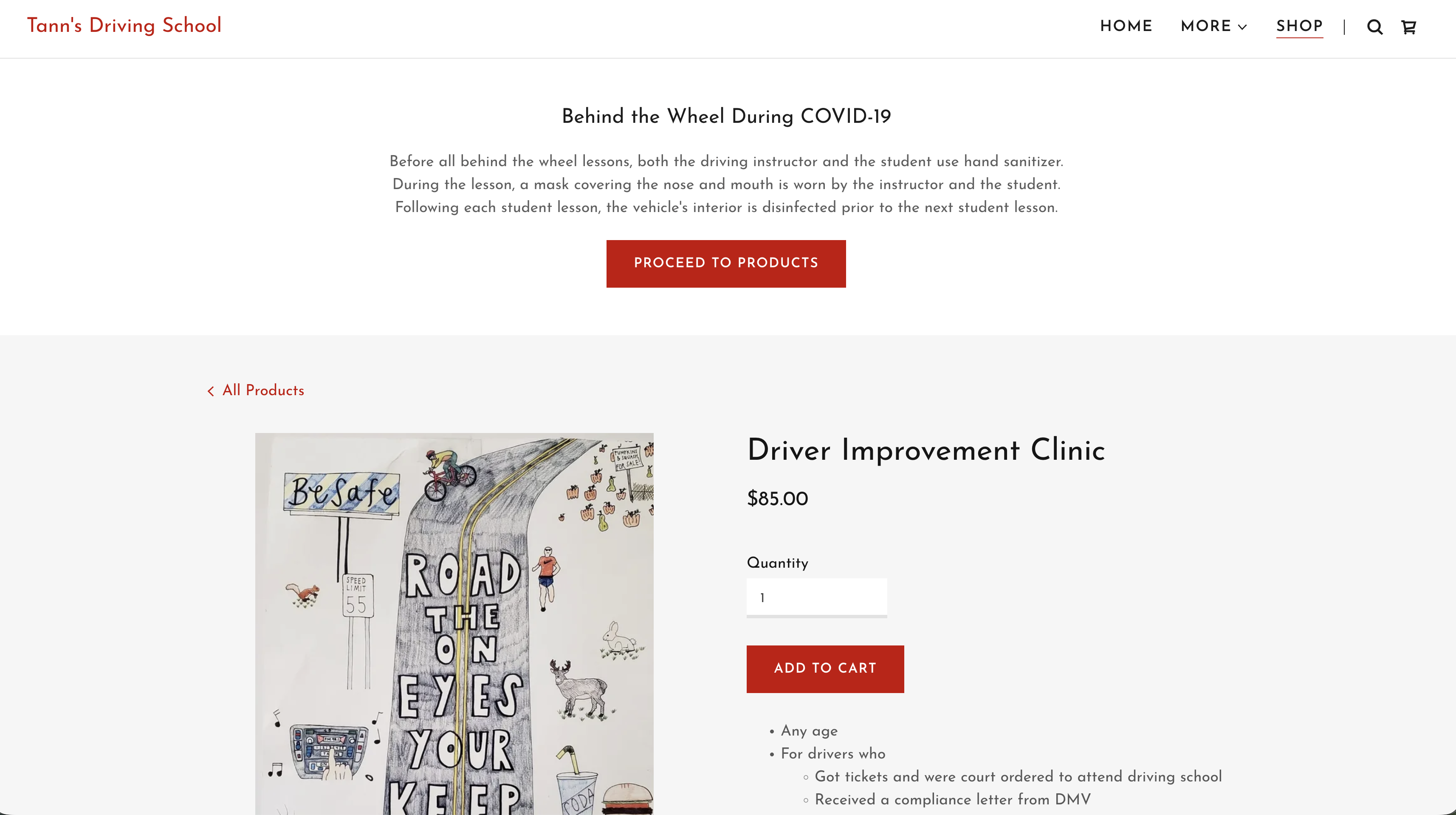
- The first thing visitors see is irrelevant. The page leads with a message about Behind the Wheel training during COVID. Someone visiting an 8 Hour Clinic page wants information about that clinic — not Behind the Wheel lessons. It only creates confusion.
- Some helpful information is present, but key details are missing. They list who the course is for — drivers who:
- were ordered by the court to attend
- received a DMV compliance letter
- want safe driving points
- may qualify for insurance benefits
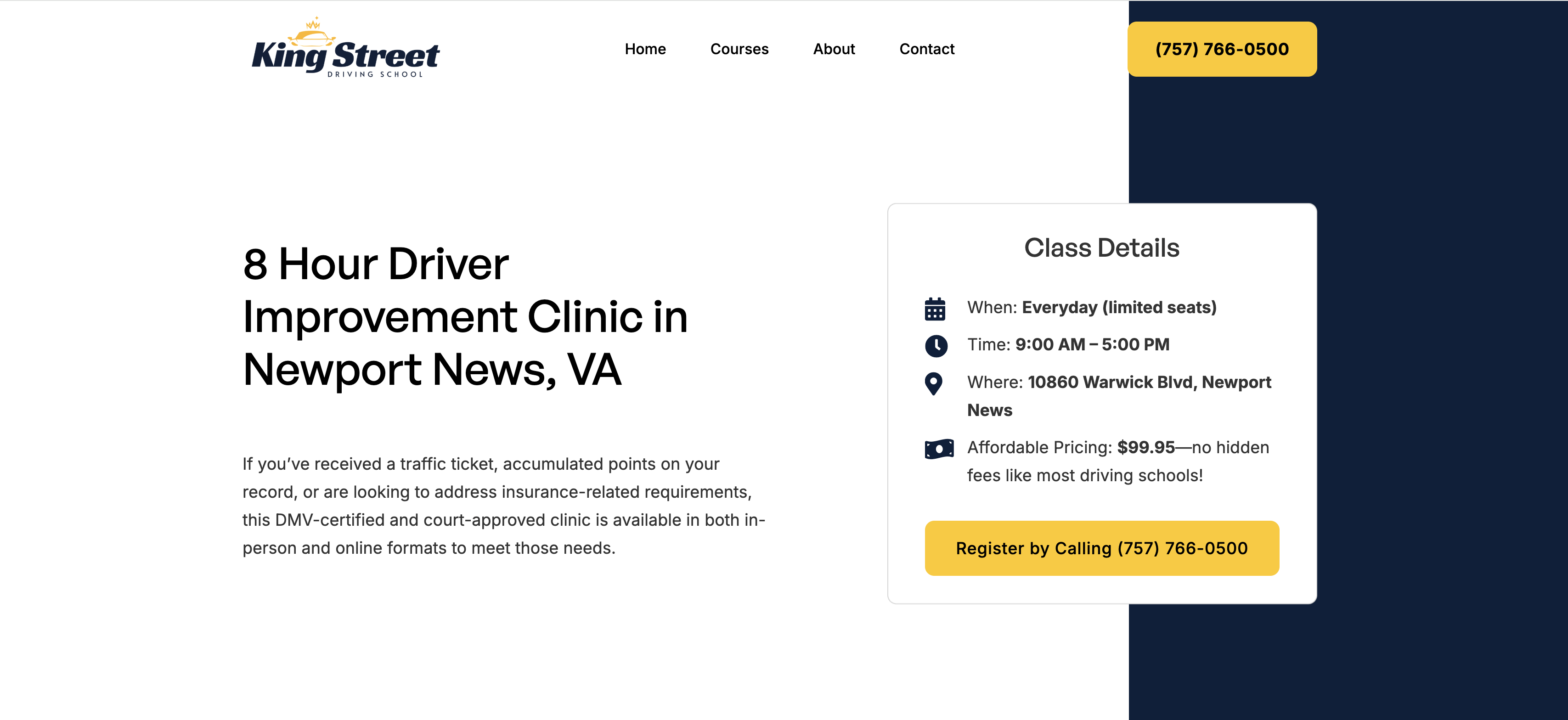
- The title includes "Newport News, VA." This helps Google understand where the business is located, making it more likely to appear when someone searches for a driver improvement clinic in Newport News.
- The opening description builds confidence. It helps visitors confirm they found the right course while answering an important concern: whether the course is certified.
- The most important information is visible immediately. Pricing, next steps, and a clear sign-up button are easy to find without scrolling. Additional details appear farther down the page, but the essentials are right there.
That's how a course page should work: quickly confirm fit, answer key questions, and make it easy to register.
Develop the Website
When developing your website, there are three key areas to focus on: speed, mobile optimization, and search engine optimization (SEO).
Speed
Slow sites frustrate users, increase bounce rates, and hurt conversions. Fast sites also tend to rank higher.
Mobile
Most visitors view your site on their phone. It should look great and function smoothly on every screen size.
SEO
Build the site so search engines can easily understand and rank it — that's how new customers find you.
By focusing on these three areas, your website will be better positioned to attract visitors, keep them engaged, and turn them into customers.
Make Taking Action Simple
Once someone is ready, don't make them work for it. Use:
- Clear "Register Now" or "Book Lessons" buttons
- Short, simple forms
- Easy-to-find phone numbers
- Quick contact options
Many driving schools lose customers here by making the process too confusing or time-consuming. Even small improvements can make a big difference. Removing unnecessary steps and simplifying forms often leads to far more registrations.
I accessed this page after clicking Register Now on the homepage for the online 8-hour driver improvement clinic.
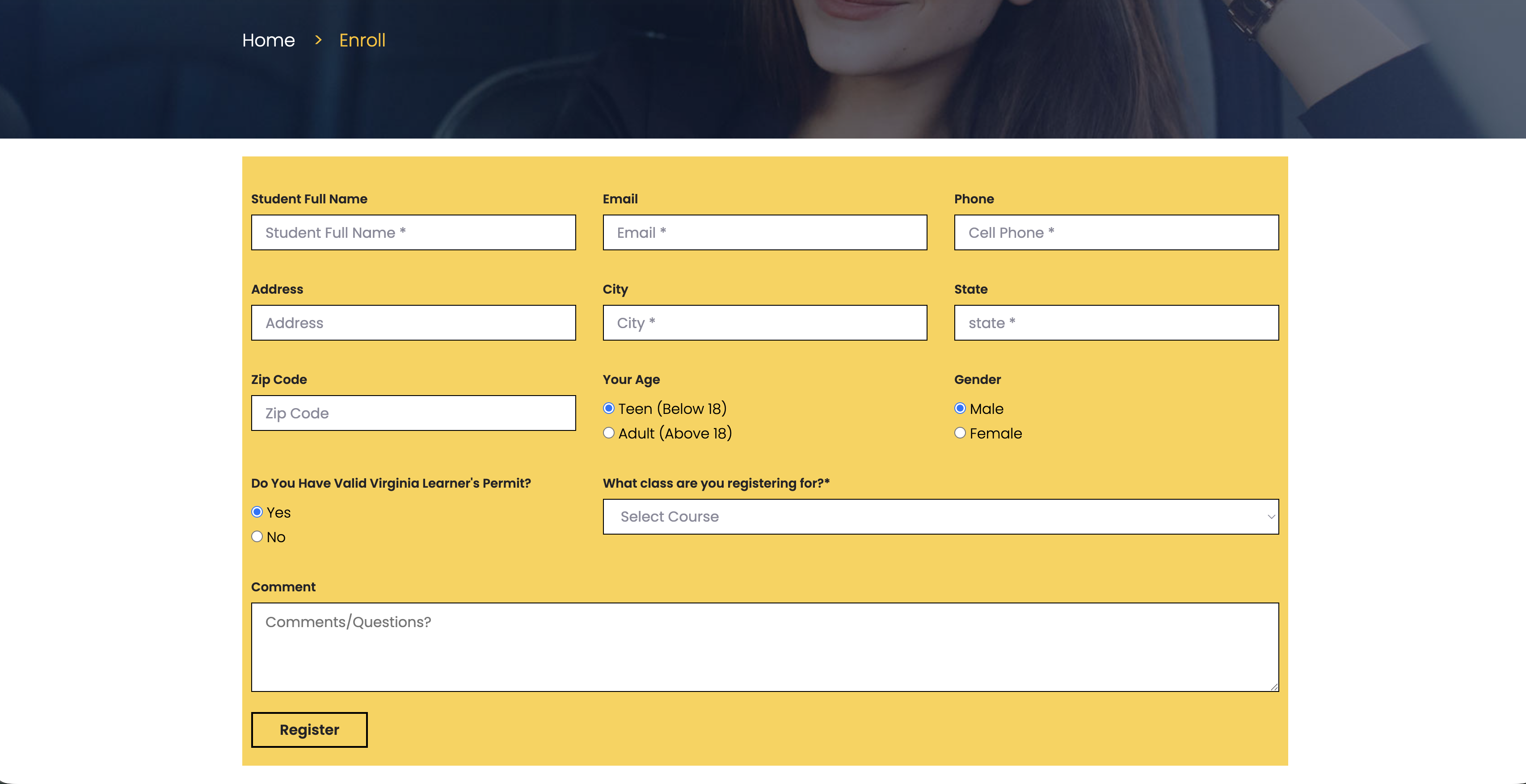
- The form asks for 11 fields, most of them unnecessary. That creates friction and reduces conversions. One study found that reducing a form from 11 fields to 4 increased submissions by 160%. Many of the requested fields are irrelevant — gender, for example, has nothing to do with enrolling in this course.
- Users are required to reselect the course they already chose. I clicked Register Now directly under the online 8-hour driver improvement clinic. That intent was already clear. Asking users to choose the course again adds needless friction and increases drop-off.
- The post-click experience completely misses user intent. After clicking register, I landed on a page that said, "Thanks! We'll reach out shortly." That makes no sense for someone ready to buy and begin immediately. This takes a hot lead — someone prepared to pay — and blocks them from completing the purchase. Most users at this stage would simply leave and choose another driving school instead.
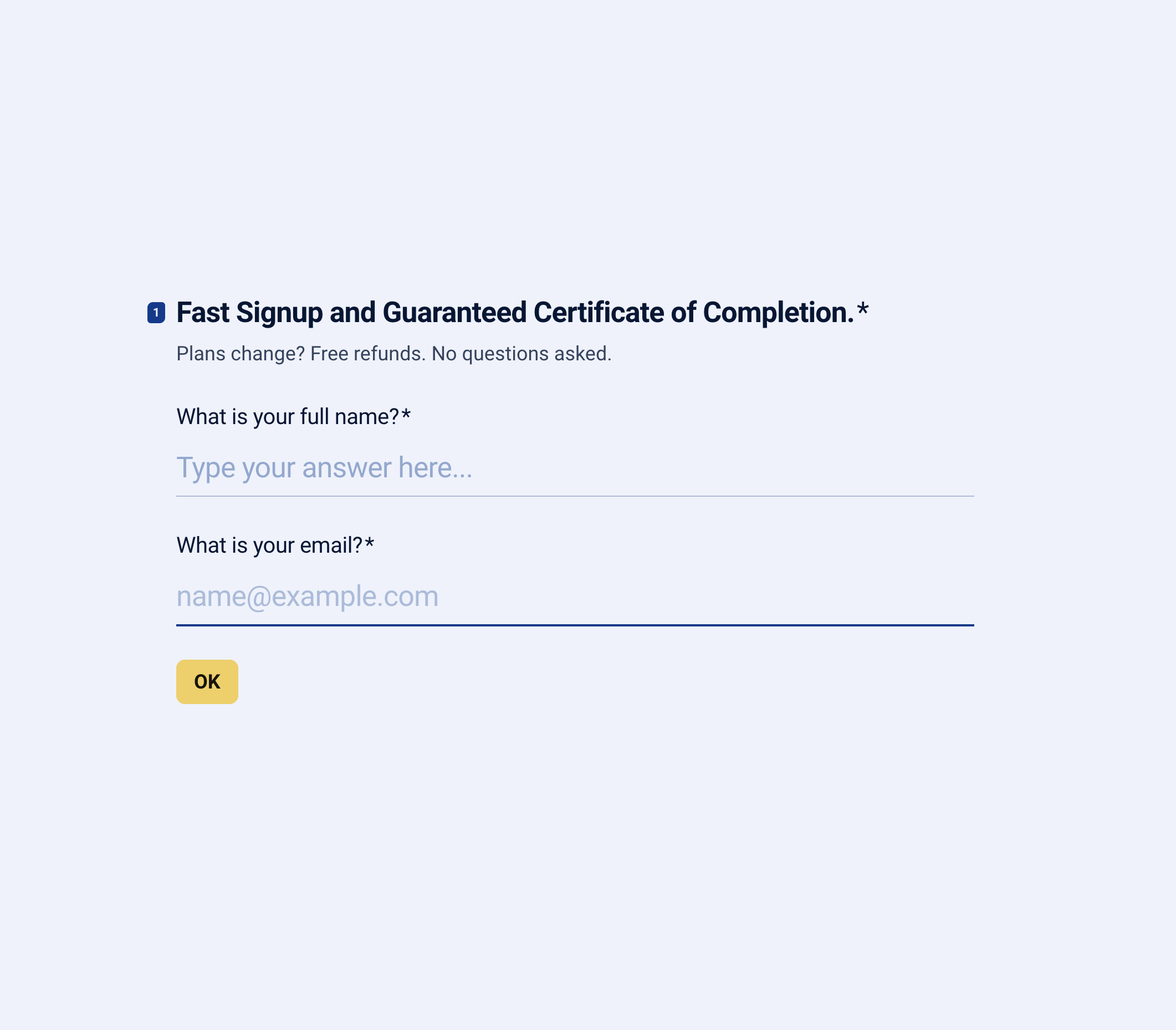
- The first page is simple and only asks for the information needed to serve the student.
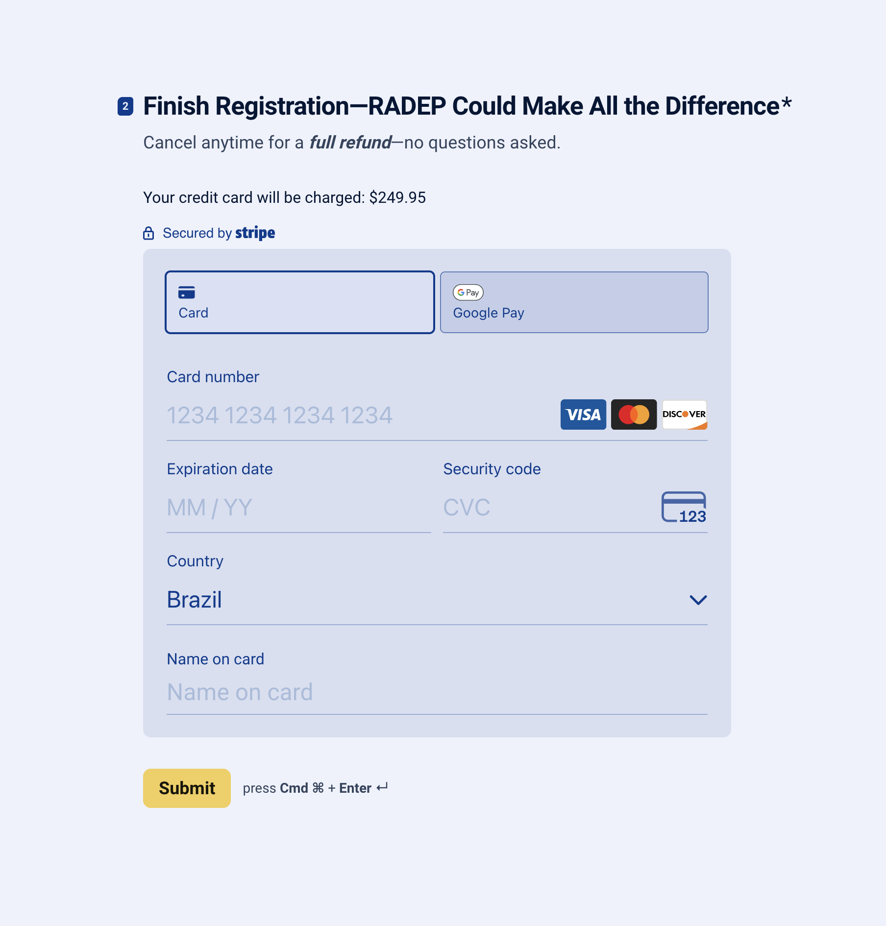
- It uses another chance to increase conversions by reinforcing the value of RADEP and offering no-questions-asked refunds. For this driving school, refunds occur only about 1% of the time.
Final Thought
Your website should be more than an online brochure — it should be one of the most valuable tools in your driving school. The schools that grow consistently are the ones whose websites build trust, answer questions clearly, and make registration simple.
When those three pieces are in place, your site can bring in new students every day without relying on extra staff, missed phone calls, or manual follow-up. Even small improvements — clearer messaging, faster load times, better forms — can lead to significantly more enrollments.